El Segundo Scene
Created and maintained by Mo and Flo as a way to connect their tight-knit community, the El Segundo Scene shares curated local artwork and writing mostly through print media. My goals for this project were to look at their website as an extension of their wonderful magazine, and to help ensure they can keep doing their great work with the financial support of local business advertisements.
Tools:
-
Figma
-
Miro
My Roles:
-
User Researcher
-
Information Architect
-
User Experience Designer
Duration:
-
2 weeks
.png)

Understand
This lovely community arts magazine started out as a a dream by a former editor and publisher as a way to highlight the culture and creativity of their home town. As they deliver free magazines to every household every month, the entire funding of the magazine comes from advertisements placed by local businesses.
The Website Problem
The El Segundo Scene creators feel concerned they aren't getting enough local advertisers, they need to increase the number of advertisers in their magazine but also want to ensure their webpage is still easy-to-access and enjoyable for readers.

.png)
Research
Before taking a deep dive into the El Segundo Scene's webpage, I looked at similar community arts websites. I took special notice of how they organized their navigation and appealed to advertisers.
Common Navigation Patterns
I pulled out larger local newspaper websites as well as small-town arts-focused newspapers to take note of their information architecture.
.png)
Point of View
Using the different navigation styles I found, I next examined the El Segundo Scene website next through a few specific lenses--the Advertiser, the Digital Reader, the Local Creator, and the Print Reader.
In red, you'll see some items I thought that user would not like, while in purple are some actions I would suggest to include.
.png)
.png)
.png)
.png)

.png)
Ideate
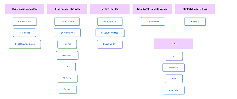
First, I audited the current information architecture of the El Segundo Scene's website to make sure I understood the present website's functions. Then, I took my notes from the user journeys, as well as notes from the different navigation styles to sketch out some potential navigational organization formats that would meet the needs of all my different user types.
Current Navigation Options

Upon first glance, the location, sizing, and total number of buttons a user can click from the home screen was pretty overwhelming. My first instinct was to figure out what each user would prioritize, and to create a stronger visual hierarchy so the eye has a less complicated path down the screen.
The Advertiser Flow
.png)
The Digital Reader Flow
.png)
The Local Creator Flow
.png)
The Print Reader Flow
.png)
Card Sorting the Navigation


While sorting, I realized that there were many redundancies that could consolidate the options in their main navigation. I also noted that having a main navigation button for their instagram feed in addition to the social media icon button leading to the same place was unnecessary.

Iterate
After discussing my user flows and card sort with the El Segundo Scene creators, I created a new version of a navigation layout. These first iterations relied heavily upon the blues and purples often used in the El Segundo Scene marketing, and structurally organized its navigation options by function.
Top Navigation Bar

The top navigation bar now has a singular button to bring the user back to the homepage. Users that are looking to interact with Mo or Flo would find all their options here--whether they wanted to learn about them or contact them to make a purchase, submit their artwork, or advertise with them.
Bottom Navigation Bar

The bottom navigation bar is for the users that have come to the El Segundo Scene site to do some reading! They can access the magazine's blog posts by keyword as well as download digital versions of the whole magazine. I chose to differentiate between the downloaded digital options and the online blog posts though location and color.
Socials Navigation Bar
.png)
It is much more common for companies to link to their social network using their logos--the El Segundo Scene's old website had an instagram feed button in their top navigation and other social media logos in their webpage footer, but since their blog pages continuously loaded more posts as you scrolled down, you needed to act fast to click on them.

Mockup
Still keeping with the El Segundo Scene's overall blog-like look and feel, I took this new information architecture structure to put together a mockup of their homepage.

The Old
Homepage
Navigation
.png)
My New
Navigation
Proposal

Next Steps
I would love to take more time to user test the new navigation layout with potential El Segundo Scene website users to ensure that the navigation hierarchy allows for everyone to find what they're looking for easily. I would also love to dive into the El Segundo Scene's other sub-pages to potentially help this great community arts magazine reach its full potential.
